Showing posts with label Miguel Bryan Carrillo. Show all posts

Friday, 14 January 2011

Evaluation

1) The process of producing a music video, digipak and advertisement was a long an strenuous task, we broke down all elements of each media product and made it similar to successful professional counterparts. Firstly we needed some inspiration from real music videos that we could emulate and be able to learn from them in order to come up with a decent music video.

Our inspirations were:

Eminem feat. Rihanna - Love The Way You Lie

Tinie Tempah feat. Eric Turner - Written In The Stars

Sugababes - About You Now

Kanye West - Runaway (Full-length Film)

All videos contributed and had parallel parts in our own video, this gave our video a look that followed the conventions of music videos that you see on music channels rather than a viral video found on YouTube.


Our main inspiration came from the video to Sugababes - About You Now, we had decided that our video was going to have two artists and a storyline. After some brainstorming we came up with our final, main concept for the video, this was to have a couple meeting each other on a London bridge. The video would include a lot of journey time as we wanted to capture the couple's journey towards each other, we liked this idea as it would make the video interesting and capture London and city life. When we found the Sugababes video the concept was almost identical, the video had a couple meeting up and we new we needed to take various ideas from the video in order for us to make a video that conveys its storyline instead of having a video where it looks like two people are simply walking. We found that many of the shots were hand held, this visual style was great as it gave the video an in moment feel, almost live feel to it which we were all for to be used in our project. Another aspect gained from the video was many of the camera angles, camerawork and also we gathered that the shots in our editing would be fast paced to make it exciting.


We used a wide range of camera shots to make the video entertaining.

Here the female walkes pased the camera on a closeup, both the shot and footage was unique. 


The final scene is similar our though a close up. We then used a rising shot unlike in the Sugababes video.

To begin our video we needed to set the storyline and create a typical image for a cheating male, we needed to do this in order for the song to somehow relate to what was in the lyrics in the song. The main phrase in the song by Wiley featuring Emile Sande is the title of the song 'Never be your Woman'. The lyrics clearly send the message of a woman saying she isn't the right girl for this guy or a guy in general. The story line therefore fits lyrically and visually. The video begins with the male character waking up next to a woman, after the video ends we can clearly realise that he's having an affair or even affairs with other women as he is not satisfied by one woman alone. The video we related this beginning scene to was Eminem feat. Rihanna - Love The Way You Lie, the video was not entirely similar but allowed us to learn how to represent a man cheating with a woman with camera angles and a display of micro features.

This birds eye shot was the most similar in both videos. 
When creating the video we knew that the artists singing in the video needed to have exciting scenery around them, we needed a location that would look good and go with the city theme that we see so commonly in Grime and Rap videos. After doing some research on videos, the most exciting scenery we found an artist in was in the Video to Tinie Tempah's Written In The Stars. The scenery around Tinie Tempah is eye catching, modern looking and hip hop cool looking, but most importantly it ties in with the city theme. In the image below you can see how this simple research gave us a platform to make our video look more exciting, it also gives the video a look that differs from other genres and looks professional.


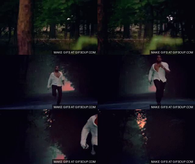
There were many other videos that inspired us, as I did the camera work one shot that i found was vital we used was when the camera man slightly moves the camera away from what is on screen therefore leaving a vacant feeling on the viewer. I first came across this while watching the video to 'Runaway' by Kanye West, this Gif. file show a quick representation of the camera shot that i have explained. 


Our video follows many of the conventions in grime music videos, we decided that we did't want to make any brash decisions and brake conventions of our genre seeing as we were mostly following the conventions in order to create a professional looking video. We did brake a convention storyline wise though, the main protagonist in our story is played by a character instead of the actual artist. We broke this convention in the video and did the same with the female artist as-well. I think we successfully broke the conventions of basic story line linking to the artist by actually placeing them in the storyline sequence because the audience was able to understand that the artists were being represeted by the characters.


Question 2

The video and the ancillary products clearly reltae, the genre features where kept the same on both the ancillary products and the video.


The night time theme is visible in both the ancilliary products and the video. The digipak and advert both link as the image used in the album cover has been used on the advert aswell. I didn't simply place the album on the advert but re arranged the images and logos so that you could see some internet based connections showing it was an advert. Our video will definitely attract people that like this genre of music, it follows conventions from the grime genre, it is fast pasted and partly filmed at night. The ancillary products will also appeal to our genre along with the advert because of the black and white theme. The image of the artist is clearly visible to the audience and this creates excitement to people that listen to grime.

Question 3


To record our video we used many new types of equipment. The camera was prime for capturing footage, the digital camera was really high quality, the stand was helpful and the memory cards were easy to use and of high memory.


To edit we used new up to date programs like final cut pro, although re adjusting ourselves to these programmes they were exceptionally helpful.


We tried to use the green screen and begun taking some shots in the green room but then decided that we would rather go to the locations and take the shots seeing as green room shots take a lot of editing to make it realistic.


We used very good software, i used photoshop elements 4.0 and made a advert and digipaks with ease. The editing of photos was very easy although it took some time to get used to. 


Another media technology was the one i'm using right now, internet blogging in blogger. I used blogger like a diary to document what resulted in being an exciting and fun project as a whole.


Question 4

We learnt a lot from reviews, i learnt that the concept of the video was actually grasped by the audience. We also did a quick survey from our class and one little error where our female artist had a handbag on her left hand then switching to her right hand but only the teacher realised luckily. I interview two people that actually like grime music and their reception was good, they were our main target and thankfully we came though. The feedback makes me look back at the project and realise that we could maybe have spent even more time on taking shots. The audience in the cinema reacted very well, my friends were very supportive of the video which was good to hear but what i enjoyed the most was the louder than normal clapping after our video was screened on screen on the green cinema. I have learnt that perhaps with time i could brake more conventions of a genre in order for it to be almost revolutionary in the media and set a new tone. Here are two recorded reactions to our video.


One of the negative reactions to our video was that we could have used more locations, we did emphasise on getting a lot of locations but still according to the view more could be used. i have learnt a lot during this blogging, recording, designing year and now how the viewer is our prime concern. Finally  this project has been tough but fun.


Monday, 3 January 2011

Research: Analysis of 3 Advertisements

Advertisements are essential for promoting anything,  I will analyse different adverts in order to identify a trend involving all adverts but also with genres that relate to my album. I chose 3 adverts to analyse seeing as i needed as much help to make my advert look professional.


This advert of Kanye West is eye catching therefore i have chose to break it down and look at what makes it a successful. The same fonts have been used throughout the whole advert, this adds consistency to the overall advert which is essential to attracting viewers by creating a positive looking advert. The artist is clearly shown in this advert, this representation works well as they have taken the picture and placed where we can see him clearly. The colours used in the advert are purple and pink, both colour work well together, i plan to use this on my digipak.


This advert contains the album cover by professor green. The fact that image used in the album works efficiently as there is a clear connection to what he is promoting. The colours are used well with the text, therer are only two colours being used for them. The background is the same from the album and again helps relate to the album. There are two logos that show where you can get the album online, itunes and play.com. 


This advertisement is of the basement jacks, they use a funny and experimental image of a gorilla which was also used for the album. I have decided to use this in my advert because there has to be a relationship between the album and the advert. The title of the artist and the name of the album are the same and this worked well. There is a lot of colour in this advert but still manages to look good. I wanted to look at this advert because it was of a different genre but is still an inspirational advert that follows a set standard apparent in all adverts in the media today.

In my advert i will use different fonts for the album and the artist as i want to create a icon for the album alone and the artist. I want to create a certain font that would be used for the artist in every album, only changing the name of the album for different releases. 


Saturday, 18 December 2010

Planning: Digipak


These are some images of our male artist, i decided to get some images of him that could fit the digipak. The expression on his face is normally serious one of the themes i see in the professional genre of digipaks to this song. I got many shots so that i could have many images to choose from and have a trial and error when using photoshop.


Thursday, 16 December 2010

Analysis 3 Digipaks

Digipaks are essential in the advertising marketing industry, not only does the Digipak package the disc but most importantly it sells the artist, by using images that catch an audiences attention. It incorporates many different things such as where to download the artists music, logos from record companies, thanks to fans and family on the inside and obviously song list on the back.

This DigiPak relates to my genre its also grime/rap like Wiley our original artist. The front Cover shows the artists face, the parental Advisory logo is obvious and will definately be put on my Digipak. The artists name is in big lettering along with the album name. The overall Digipak is very simple, the attension is placed upon the artist and also the tatoo on his neck.


This album cover belongs to Devlin, he is another rapper associated to grime and the Digipac has caught my eye. We can see the artist up against a wall, its a simple image, his facial expression is serious as most grime artist like to represent themself like serious people. The artists name 'Devlin' is the most significant and outstanding part of the digipac.


The Dark lighting here is what attracts my attention, the graphic editing where you can see the artist holding what appears to be New York City looks interesting. The font used for the artist name and album name are the same, it collaborates well with the theme of the whole digipak and this will be taken into consideration.

My digipak will contain the image of the artist, an effect on the background to add graphic effect. The colours will all be black and white and will follow on the advert so that they can relate once more. 


Final Video Vimeo


Dennetta, Fabian, Miguel, Ira from 283goswell on Vimeo.

Analysis of One sequence from Rough Cut

One sequence that was vital was where our actor, Fabian, had to put across to the audience and we had to capture an essetial part of the concept where he was clearly with a woman in the same bed. This scene was increadably important, unfortunately once we put the clips onto Final Cut pro and were able to see them we felt the shots wee too dark. Weconsulted our teacher for a scond oppinion and it clearly made an impact in contrast to the rest of the shots which were caught in rich lighting. We quickly got our equipment and although we hit a slight dilema where the actress from the scene couldn't participate we dressed our team member Ira in a wig and took the shots. By taking in mind some tips from the teachers on how to capture the best shots and lighting we recorded well and finally came back to the edit suite we had excelent and much improved shots.

Wednesday, 15 December 2010

Planning: Shortlist of fonts, design, layout and design ideas.

To get started I needed to get the simple basic ideas for the digipak out the way. I needed a font, layout idea, design ideas which would allow me to research various types of ideas so that i could choose the perfect one.

Font


These are all font that I initially wanted to use, i then finally came to the conclusion that i would use the, Enduro Dos font seeing as it looked modern and eye catching.

Colours


The colours i want to use where definitely black and white, the silhouette dark urban effect it has to it makes it look entirely professional in my opinion. The image below is an image that i want to recreate for my digipak, the black and white theme works perfectly even for the genre of music.


Design

My design is going to have the artist as the main focus, i want the artist to look past the camera seeing and the title of the album would be 'lure of my memories' therefore adding an image that would connote a man thinking.

Layout

The layout will have the essentials logos on the back, parental guidance logo is vital for this genre and the title, image and artist name would all have a uniqueness to them.

Tuesday, 14 December 2010

Planning for Digipak: Mock up

In order not to waste time we all made mock ups of what we wanted our digipak to look like. The digipak i made follows many conventions of \ones we see in the genre of the song we made our video to.

 The whole digipak has a set theme of black and white, there are no colours involved. The title and name of the album are in two different fonts, although this is challenging i managed to get the right fonts to look professional. 


Front
The front has the image of the artist looking in a direction, past the camera, the blur effect behind him makes a day dream sort of effect which relates to the name of the album, lure of my memories. 

Back
 I also put some of the logos that I would use for my digipak. The track list was to be in the back I plan to select a font that can fit in well with the digipak.

Inside
The back of the digipak would contain a spread image across both panels in order to keep a limit of image so that there wasn't a barrage of different pictures.

Monday, 13 December 2010

Do's And Dont's Overview


Our teachers handed us a simple Do and Don't handout setting guidelines that would set us on our way to making a proffesional looking digipak.  Above is a screenshot of a section of the handout. Many of these rules had to be recited for example the rule on how we should not place text in front of the artists face, they helped me a lot seeing as  hadn't made a professional looking digipak before. The image below example of a failed Digipak, you can see the name of the artist covering the image on the screen, this covers what should be the main part of the cover. There are two different fonts used in this video, although this could be pulled of the creator of this digipak clearly uses the wrong colour and fonts as it seems like it was made in about 2 minuets. By looking at these unsuccessful digipaks the Do's and Dont's where vital. 


The image here is one of the past years final digipak. The digipak follows many of the conventions from the Do's and Dont's, there is no font covering the artist, the name of the artist, title and song list are all in the same font. The digipak works for me because there is a colour consistency throughout all the digipak sides, i will learn from these digipaks and hopefull make a succesfull looking digipak myself. 


Tuesday, 30 November 2010

Planning : Introduction to Digipaks


During our lesson we were shown how to use photoshop software. We were also introduced to  QuarkXpress, both had different effects but i decided i would rather use photoshop seeing as i had used it before.

It was an exciting task trying to make a digipak for who was our artist Dan, firstly i had to chose the right picture to make a successful front cover. The layout was important, the composition of the images, text, titles and names all had to be taken into consideration and i did some research in order to see digipaks in the music industry.

The tutorial and muck about proved successful, there were many options that made them prime editing programs to make a digipaks. These were some of the editing tools that could be used to edit the digipak.


The effects bar was easy to use, simply dragging these effects onto the layer, it would change its appearance according to the  effect you use. The layers toolbar was easy to use, by clicking the button that looks like an eye makes a layer visible or not, this helped to quickly see whether certain parts of the digipak should be removed or not. The toolbar at the top of photoshop can be used to open files, save, edit text etc.The toolbar on the left was used to select, drag, crop, add shapes etc.